Flyers are often looked at as just throwaway items, wasteful pieces of paper. How often do you glance at a flyer tacked to a bulletin board or telephone pole and don’t care enough to even read what it’s advertising?
The goal of this blog post is to teach you how to design a flyer so good it’ll catch anyone’s attention and won’t end up in the trash seconds after being handed out. A flyer is nothing to fly through- take it seriously!
Step 1 – choose the right image
First things first, no clip art. No one wants to read a flyer that looks like it was created by a 12-year-old using Microsoft Word. You want your image or images to look professional! The pictures you choose to put on your flyer are just as important as your headline. Choose something that catches the viewer’s attention but also allows the viewer to easily read what the flyer is advertising.
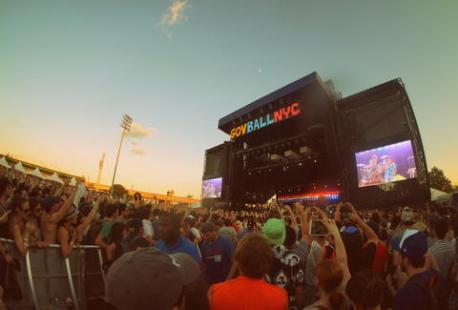
Try to find an image that has a natural empty space so that you already have a space carved out for you to put your headline and other important information without cluttering your flyer or making it difficult to read. On the right is the image I started with when making my flyer. I chose this particular image because of all the space there is at the top of the photo. I immediately thought that this would be a good area to put the headline.
Step 2 – make a snazzy headline
Okay, now it’s time to think about your headline. I used this article, 11 Formulas and Strategies to Write Irresistible Ad Headlines to come up with my flyer’s headline. Similar to how you want your image to attract the viewer, your headline must be powerful enough to draw viewers in as well.
I know your first instinct will be to write every single detail about whatever your flyer is advertising but STOP! Only include the most necessary information on the flyer, and be sure to put a website or contact info so that the viewer can find out more information if they’re interested. No one is going to read a novel that’s been printed on a flyer.
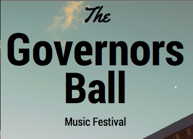
In my flyer for the Governor’s Ball Music Festival I included a few of the headlining musicians, the date, location, and the website, that way people who are interested know where to go to find out more information about the event. Less text draws more attention to the image and headline instead of bombarding the viewer with too much information.
Step 3 – create visual hierarchy
Now that you’ve found the perfect image, came up with a bold flashy headline and decided on what important information you’re going to include in your flyer, the next step is organizing it so that it flows 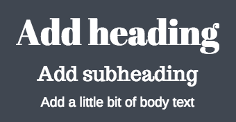 nicely on the page. I found this article by Canva about visual hierarchy to be extremely informative, and I’m sure you will find it useful too.
Notice how “Governor’s Ball” is the biggest text on the page. Your eye is immediately drawn to the headline. I put “the” and “music festival” in a much smaller type to create contrast, and so that they wouldn’t take away from the main headline. Then throughout the rest of the flyer I varied the font sizes based on how important the information was. This creates a visual hierarchy which makes it easy for the viewer to pick up on the most important information at first glance, then naturally draw their eye to any other less important info on the page.
The finished product
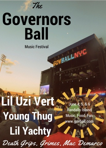
If you take into account all 3 of these steps when making your flyer I have no doubt that the result will be a masterpiece, something that people will actually want to stop and look at. Take a look at my completed flyer. Notice how you can immediately tell what the flyer is advertising before even looking at the text, without it overpowering or distracting from the text itself. They work perfectly together. The text on my flyer is easy to read and the visual hierarchy draws the viewer’s eye from the top left corner to the bottom right corner of the page.
Following these 3 easy steps will ensure that your flyer will be a great success!